Lire l'article

Attention : this tutorial is part of our preparation to the exam PL-300.
---
The purpose of this article is to explain how to generate an Organization Chart in an industrialized and fast manner, without error and with the minimum of manual interventions, in order to be able to display it in Power BI.
If your prefer a video rather than an article, go to the bottom of this post 😉
This organization chart should allow to visualize complex organizations, with large quantities of entities (up to several hundreds), several levels of ownership (ex: level 1: holding company, level 2: company A and company B, level 3: company A1, A2, and B1 and B2), as well as multi-parent relationships (eg Company X is owned by both Company A at 49% and Company B at 51%.)
In order to allow this, we have described in detail all the operations and treatments that are necessary. As we have tried unsuccessfully with many custom visuals (see image below), the use of Microsoft Visio, through the Organization Chart Wizard, is the optimal solution we have envisioned.

As far as we know, not any of the following visuals enabled the automatic creation of Multi-Parent diagrams
Find here how the chart looks like :

Our Organization chart looks like that. "Entité b.3" has 3 parents. No other visual in Power BI enabled Multi-Parent Organizational chart than Visio.
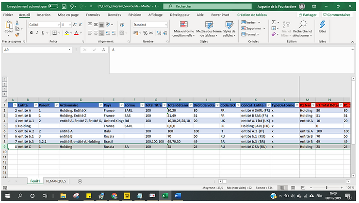
This is your Excel source file. If an entity has several parents, just put the attributes in the same column, separated by comma. ie: in D8 cell, there is "Entité B, Entité A, Holding" that are the 3 values of the "Actionnaire" Attribute.
Open a blank Visio file, which is a file of type .vsdx
Go to the Data tab and then Create

You must now map your Visio organization chart.
For the process step ID (1) space, select a unique field for each unit. This will be the ID field on our model.
For the description of the process step or activity (2), select a field that would display a description of each entity. On our model, it will be Entity (in order to display the name of the entity).
The form type (3) space for process steps is described in the following section. For the moment, we are inserting the TypeDeForme field. Click Next.

Step 3 allows assigning shapes or icons based on values. (ex: Display all entities whose ISO code is FR with a specific form, or all SARL type units with a specific icon, etc.). Our goal in this case is to have a unique type for all entities.
Since we used the TypeForm field, only one value appears. We inject a specific icon (Process) for all entities. For injection, a simple drag and drop will suffice.

Connect Next to go to step 4.
In step 4, the mapping must be done to link the units to each other.
The label space of the connector (5) makes it possible to display information directly on the arrows between the units. Our business need, linked to organizational charts, assumes that this information is capital ownership rates. We will inject the Total Detained fiel.

Click Finish. The generation will be done automatically.
If you want to make some formatting (in order for the visual to be exactly like ours, at the top, contact us.
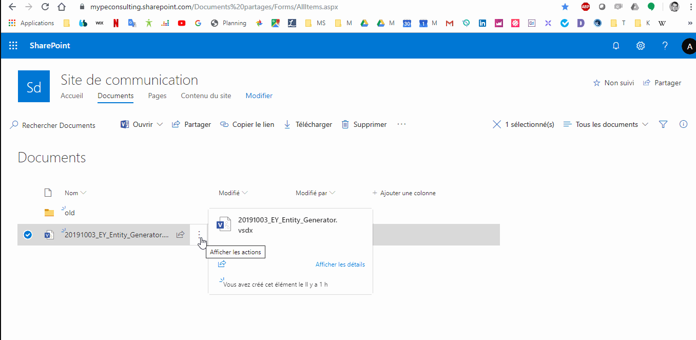
Click Save, and then select a Microsoft Cloud source (SharePoint, OneDrive) to publish your organization chart.

Once the document is saved, copy the SharePoint URL of the document (see image below).

The last step is in Power BI.
(If you don't know how, please visit this link 🙂

You now have in Power BI a 100% custom organization chart !
Part 1 > Generate Entity in Visio.
Part 2 > Embed in Power BI
Tank you for following this tutorial. We hope you enjoyed it.
Please don't hesitate to contact us for any technical issue regarding Power BI & Visio integration.
Augustin de la Fouchardiere
Tristan Bruchet
More information :
https://www.mype-consulting.com/power-bi-visio-organization-chart


